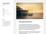
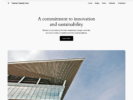
Our 2015 default theme is clean, blog-focused, and designed for clarity. Twenty Fifteen’s simple, straightforward typography is readable on a wide variety of screen sizes, and suitable for multiple languages. We designed it using a mobile-first approach, meaning your content takes center-stage, regardless of whether your visitors arrive by smartphone, tablet, laptop, or desktop computer.

Twenty Fifteen
accessibility-ready black blue custom-background custom-colors custom-header custom-menu dark editor-style featured-images fixed-layout gray left-sidebar light microformats pink post-formats purple responsive-layout rtl-language-support sticky-post threaded-comments translation-ready two-columns white yellow


Deja una respuesta